About the Project
I began informally working with Three From Above when they started as a band, but it wasn’t until a couple of years later that they joined Doing Life Records for the release of their self-title debut EP.
Unlike my work with Ed Poole, whose music is more emo, acoustic-led, Three From Above were a punk and post-punk band through and through. As a result, it was important that their sound, their message and their values were front and centre of the release.
As well, unlike my work with Ed, I led on the art direction and release of the record instead, with the amazing Tim Stevens making the visual assets and music video for Vagabond a reality.
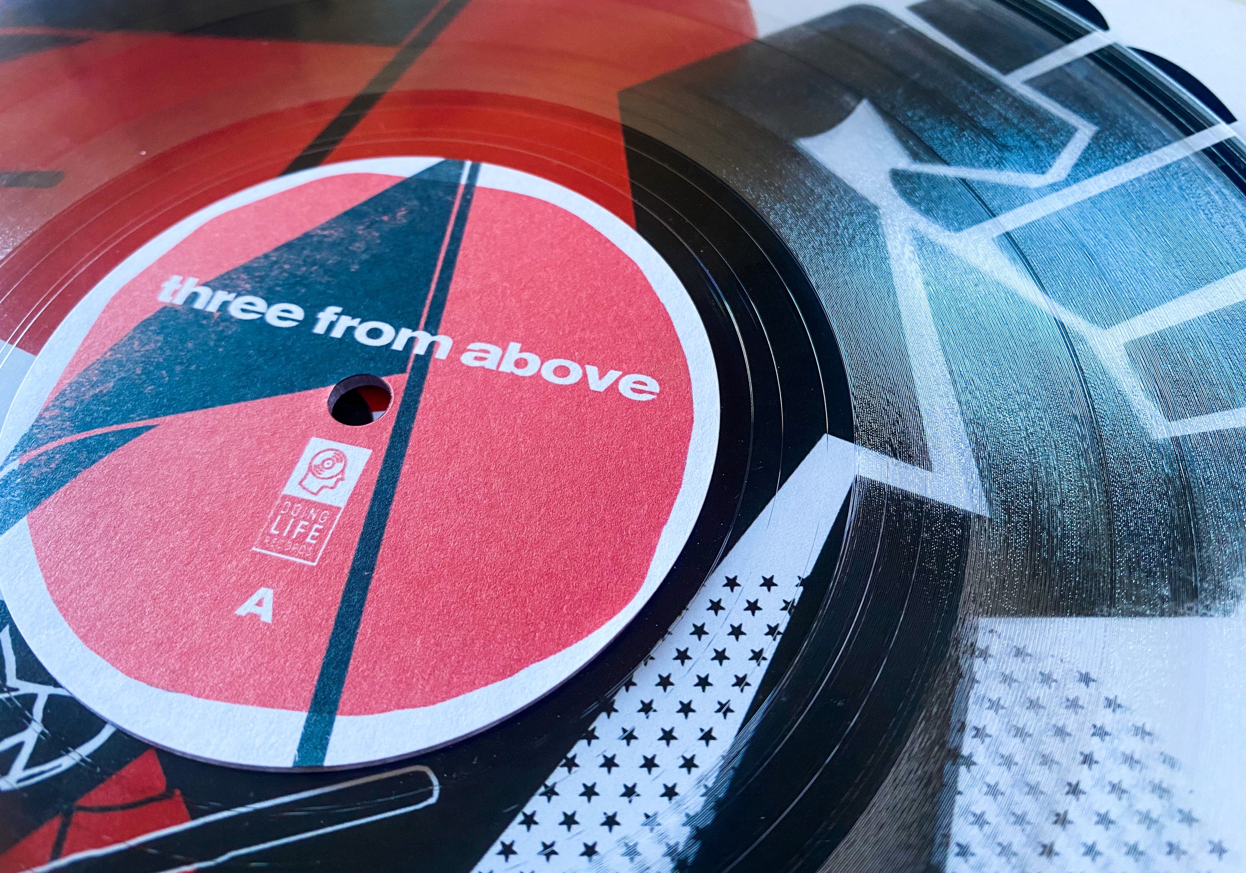
Three From Above EP was released on a limited edition lathe (/50), with each vinyl order sent wrapped in posters and scans from the Vagabond video.
Visuals
The Process
There were a lot of early discussions directly with the band about how they viewed their first official release, and between us the beginning of what would become the finished article began.
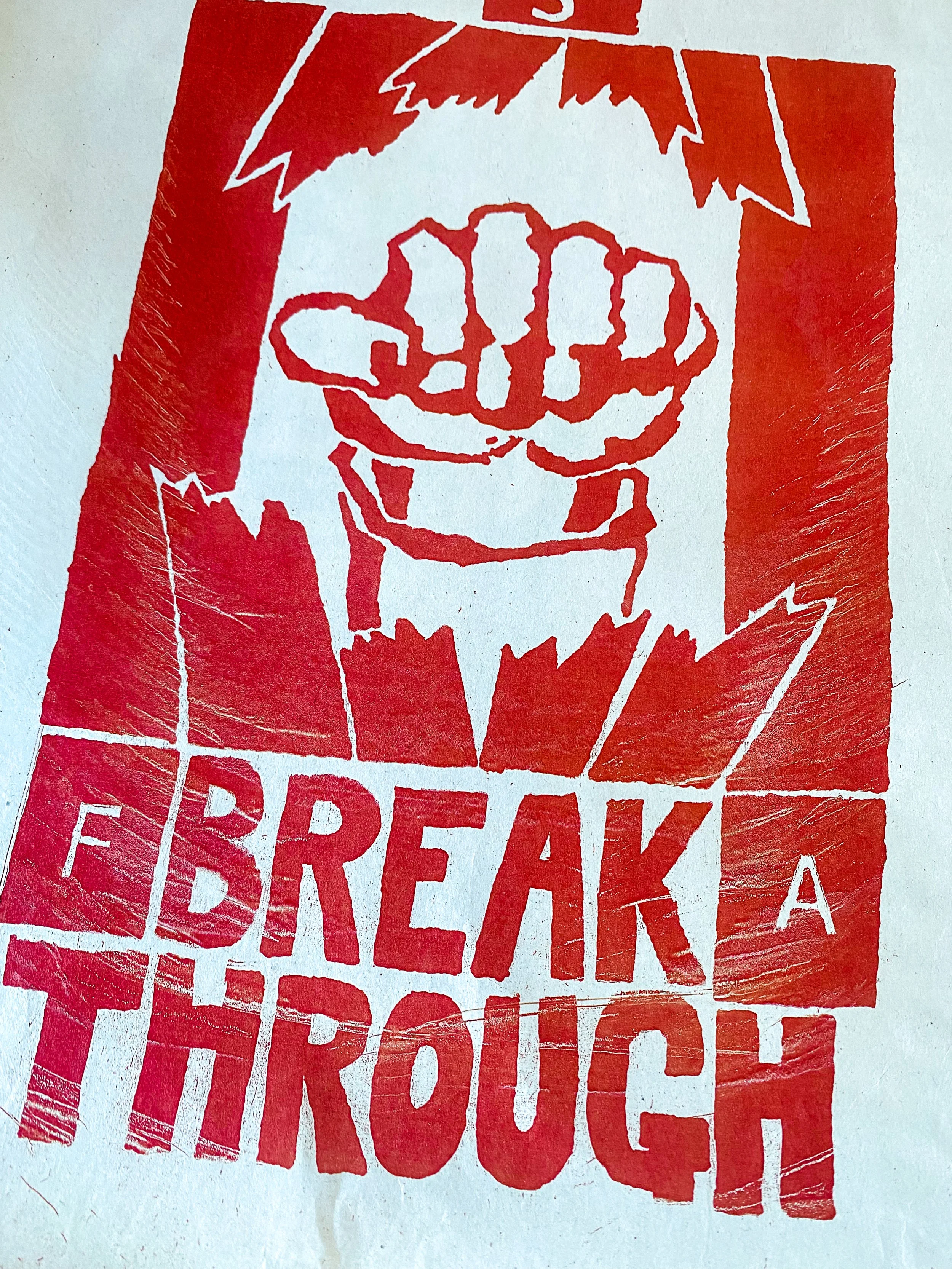
One of the key visual markers I pushed to the band was the poster designs of the Atelier Populaire, a key component of the Mai 68 protests in France. Not only were they stark, minimal, direct and vibrant, but I felt they also perfectly encapsulated their progressive, DIY and semi-anarchic message.
The band quickly brought Tim into the fold, and with the Mai 68 posters, other moodboards from the band, and core messaging in hand Tim set to work in creating what would become not only the Vagabond video, but also the visual assets seen above.
As this came together, I worked with a local artist (who I can’t name!) to design the front cover using the same inspiration, and after some tweaks and discussions with the band, got it all agreed and I started to put the release together.
Choosing lathes over vinyl, as well as the half sleeve was purely aesthetic, as a way of again highlighting the DIY punk mantra of the band.
To finish the record off, I designed the centre labels and the back of the sleeve, utilising the established fonts, visual assets and colours and then put the entire record together ready for sale.
The record was then released by my label Doing Life Records, and I led on the marketing plan for the release.
How it Went
In terms of the visuals, the work that Tim did was incredible and was exactly in line with the art direction and visual plan designed. Not only is it loud, in your face, and filled with anarchy and energy, but the main visual inspiration, the Mai 68 protests, was so well weaved into the visual design.
The vinyl itself on completion came together exactly as planned, and the late addition of the posters and scans enabled us to add another special touch for fans who picked up the record.
Before the band unfortunately disbanded, over half the records sold which outsold our initial predictions. Ultimately, the pandemic made it difficult to play shows which had an impact.


